The Download
content strategy, IA, interaction design, visual design
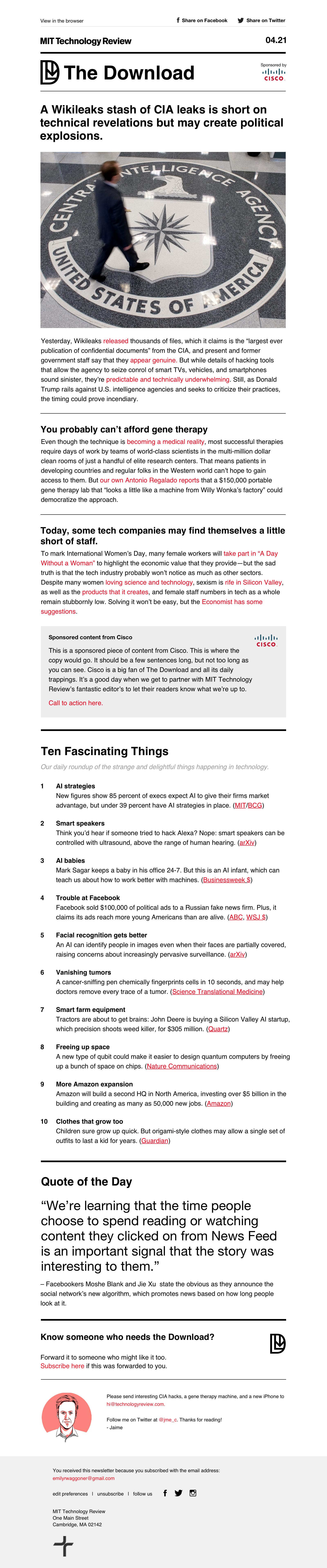
The Download started out as a newsletter and later earned a home on MITTR's website. It was the first newsletter of its kind at Tech Review, where the content was not an automatic aggregation of a particular week's stories. Instead, it's a letter written every day by a small team of editors (Jamie Condliffe and Michael Reilly) who curate stories and provide their take on what's essential to know.
Newsletter design
It called for a flexible design that could accomodate a variety of expressions.
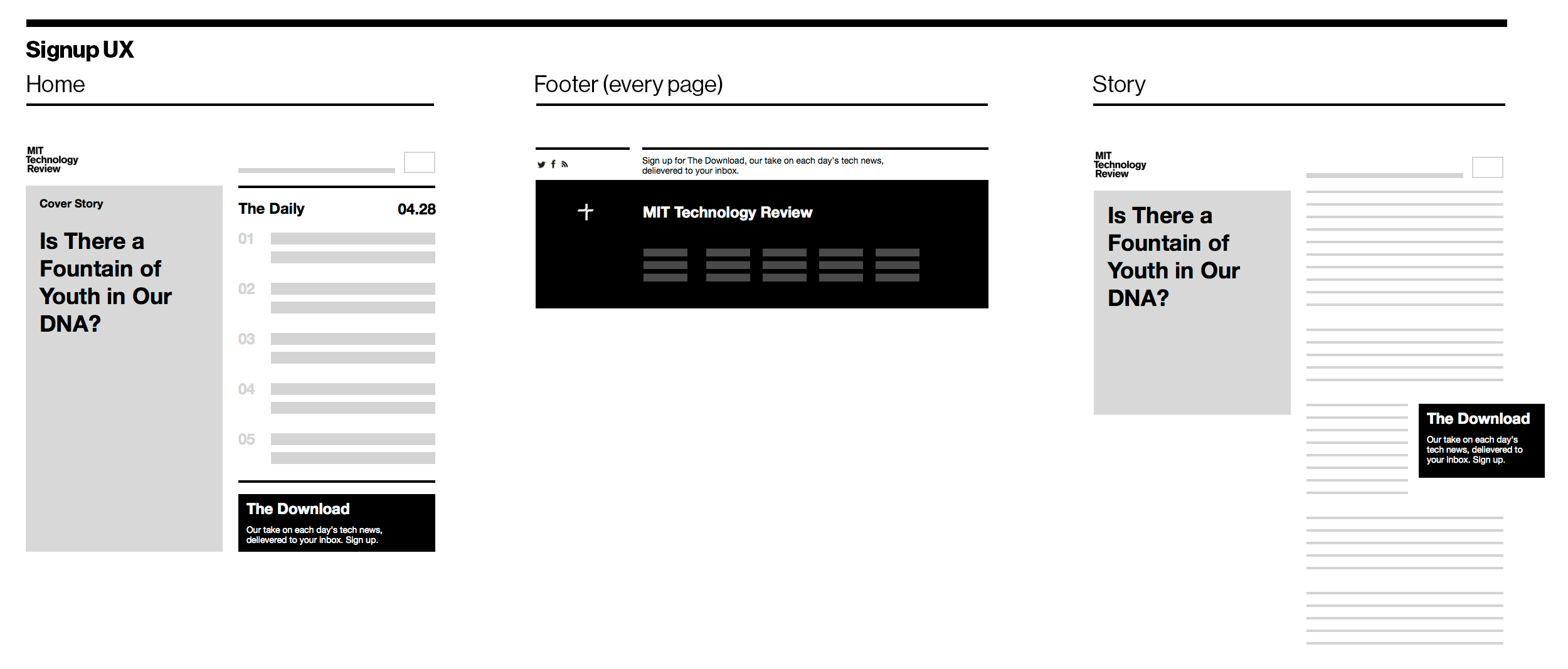
The editorial team prototyped the content which I wireframed in tandem with working out how and where to provide pathways to signing up for the newsletter on the website.
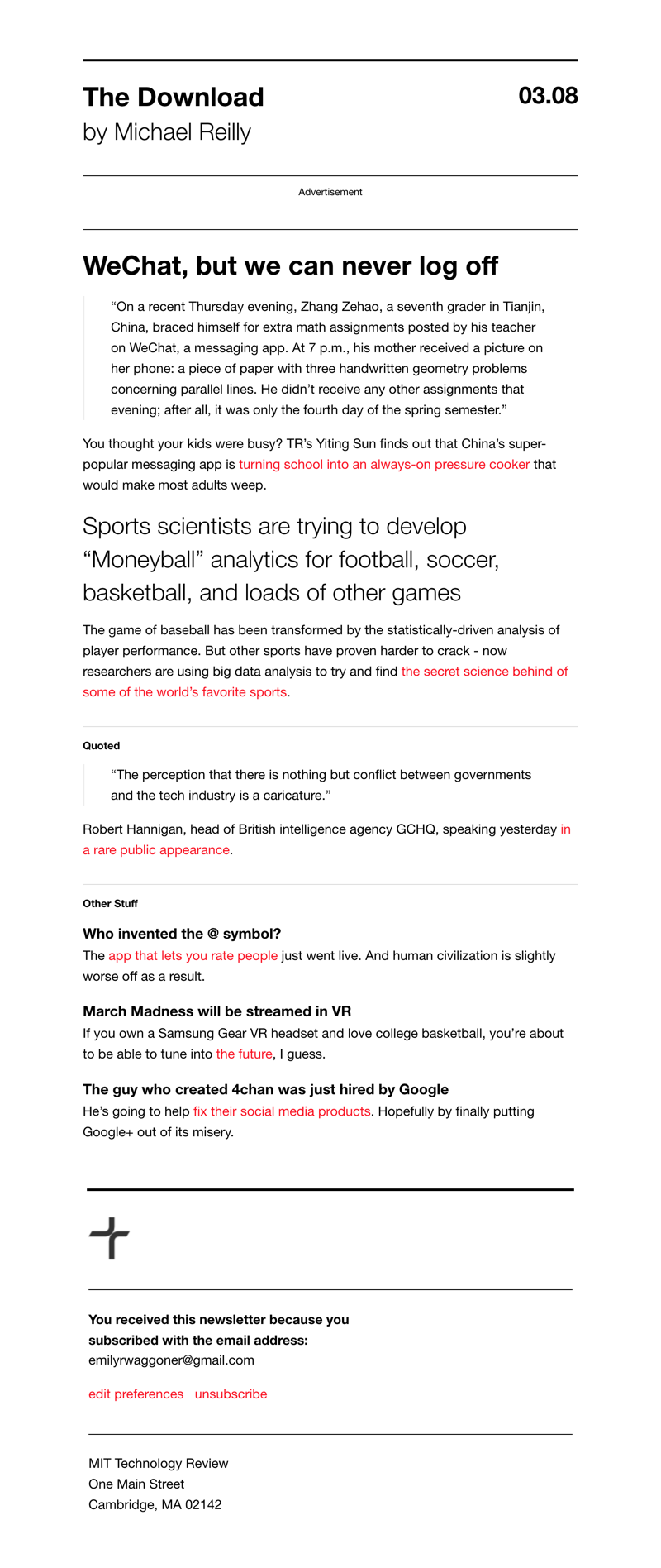
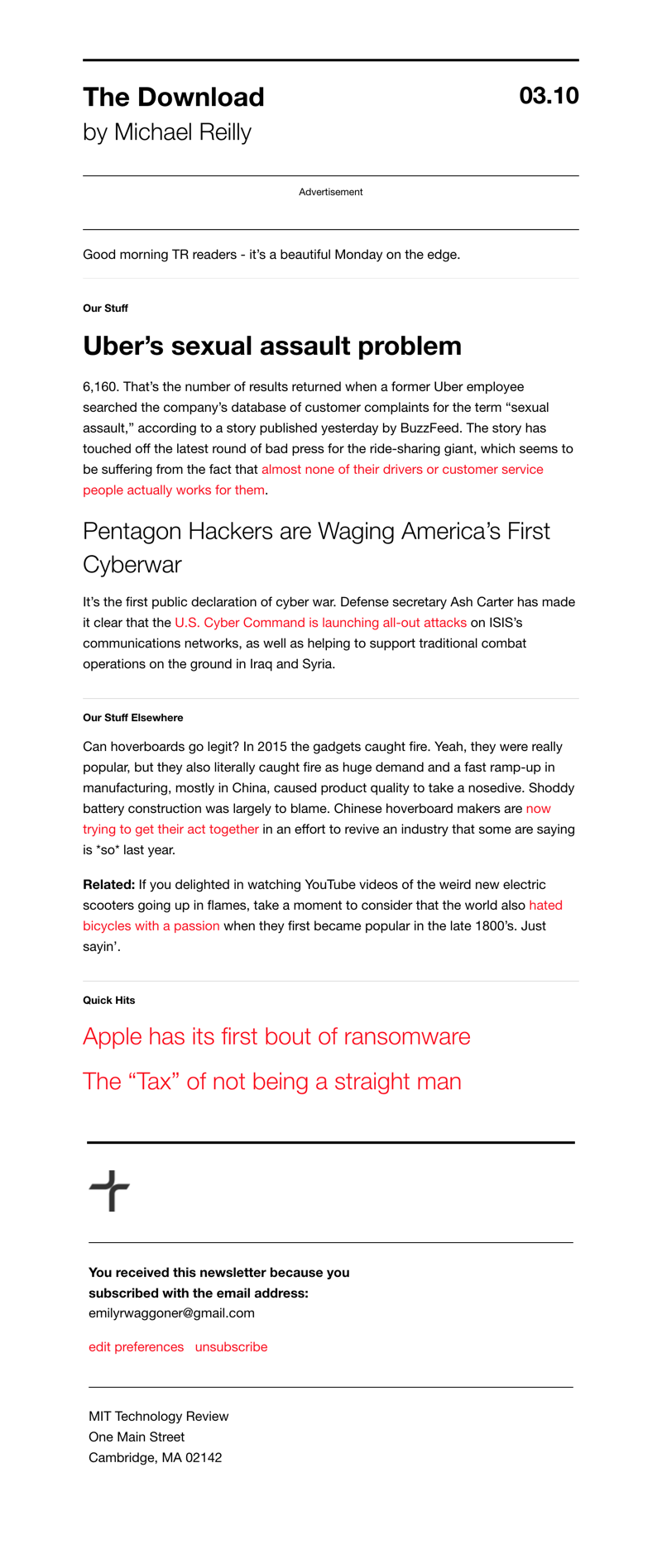
As the content started to come together, I revised and refined the design into more high fidelity mockups. We commissioned an illustrator to create a brand mark for the newsletter, and eventually settled into the right balance of structure and form.
Evolution of the product
After The Download newsletter launched in June 2016, its following grew at a steady pace for the next few months. Engagement was great, and it was a product that advertising partners wanted to sponsor consistently. By all accounts, it was a success.
Naturally, it began to beg some questions...
How can we bring some of the success of the newsletter back to the website? Could we create a place for The Download in the ecosystem of other Tech Review content?
I was tasked with exploring in earnest how we might create a new editorial product for the website based on The Download newsletter.
Goals
Along with stakeholders from editorial and marketing, we arrived at the following goals for the project:
- To differentiate between original and re-reported content
- To provide an on-site destination for newsletter subscribers
- To encourage return visits and repeat subscriptions
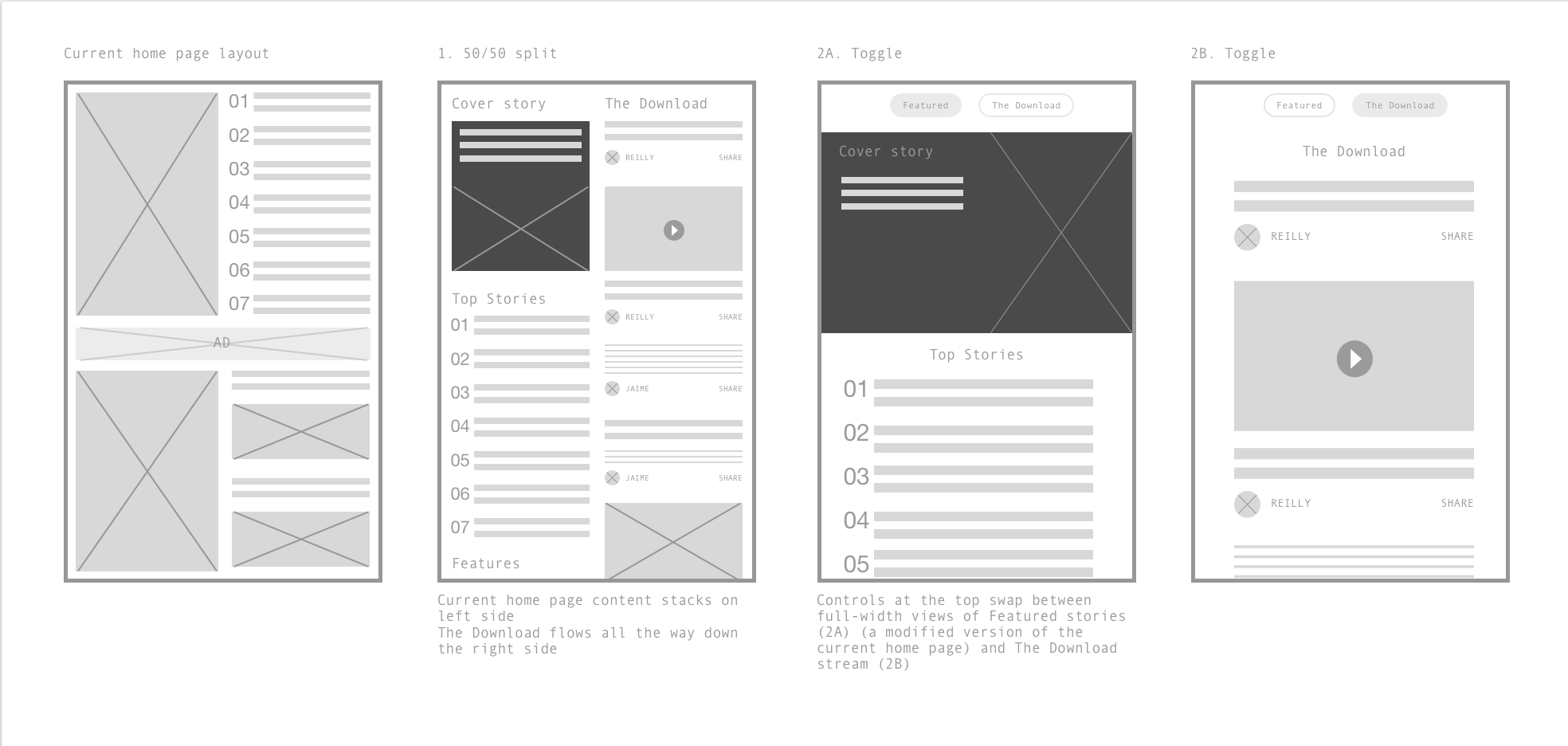
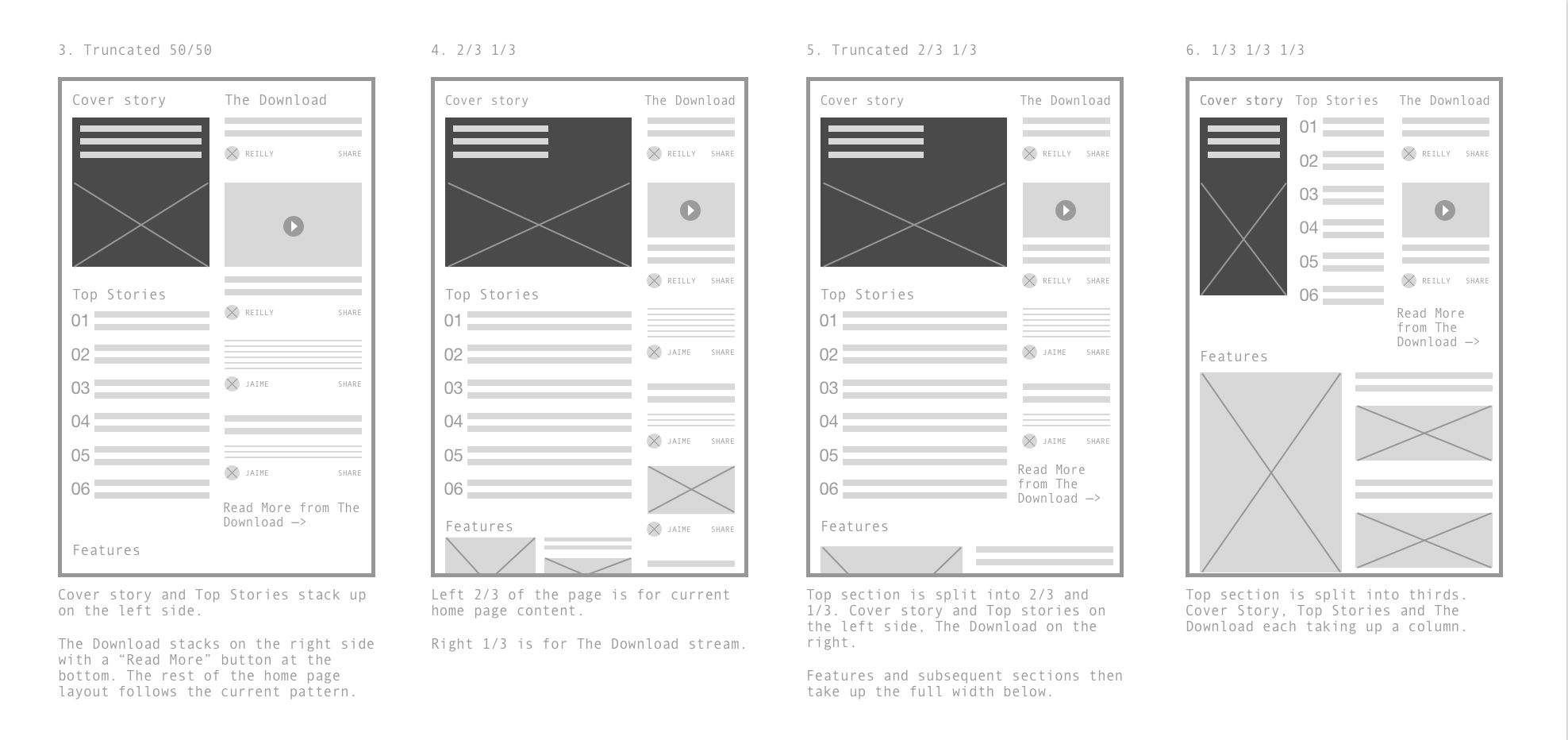
The editors began prototyping content again, this time using Tumblr as the format. That practice was useful in helping define the components that would make up a piece of Download web content.
I explored a bunch of different layout options for how this content could be incorporated into the home page. The biggest challenge here was finding the right balance for The Download alongside our other editorial content.
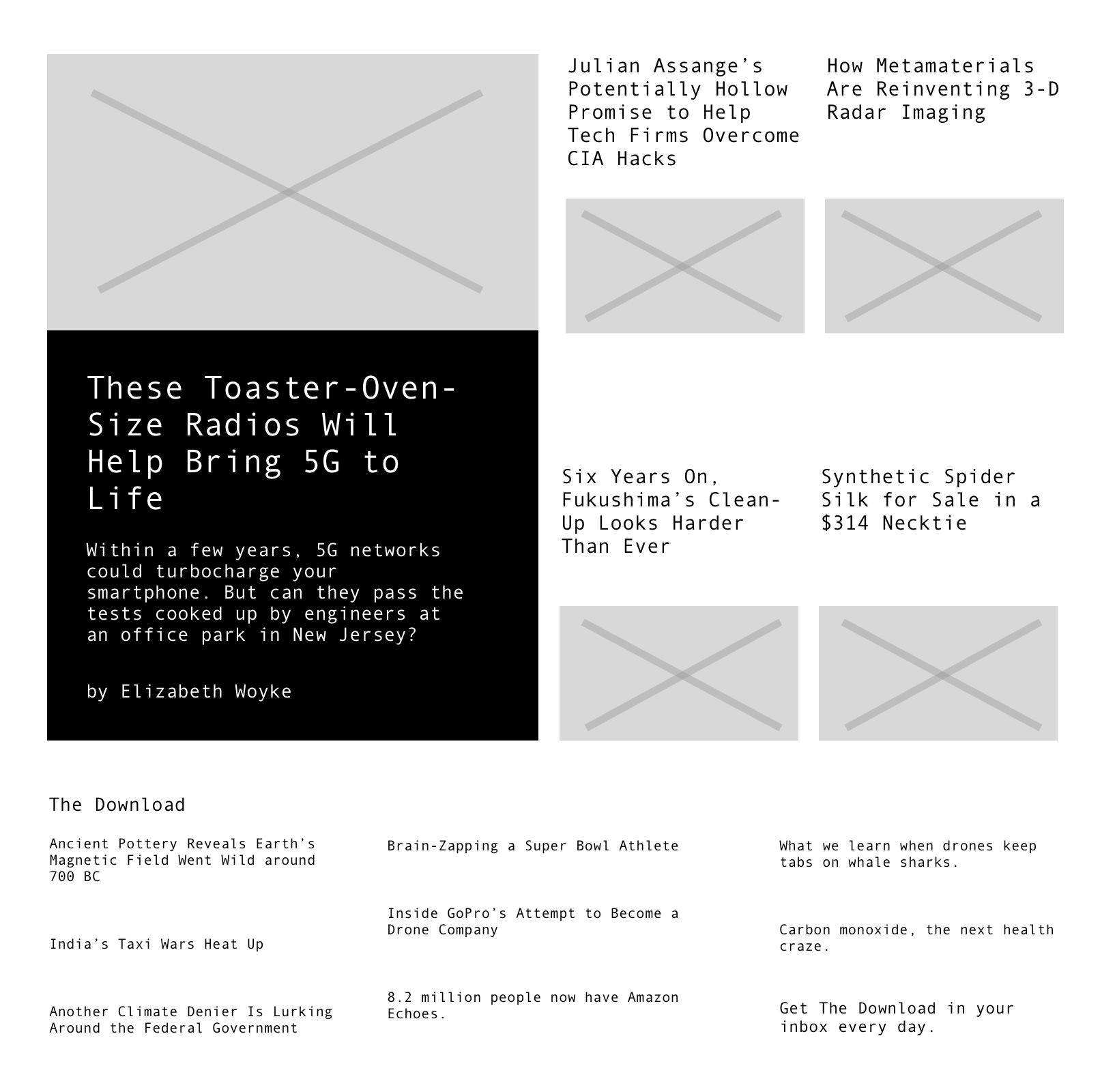
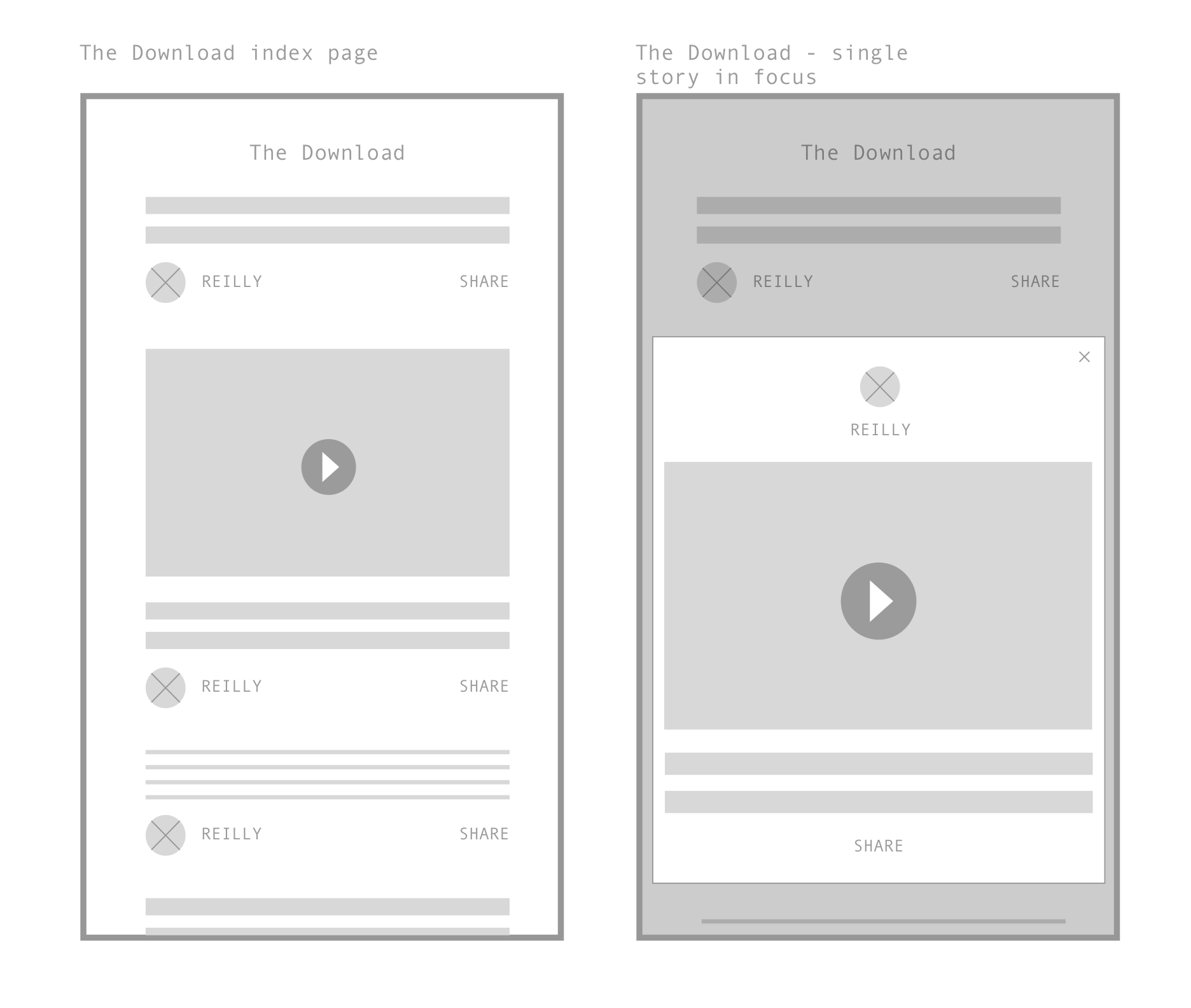
The Download Index
The Download is different than the rest of MIT Tech Review content because the posts are shorter, more responsive to the daily news, and are often stories that other publications have reported on first.
Generally, I steer away from tying the design of the story to the content type. (Because it turns out that readers care about the topic more than its type.) However, The Download content is fundamentally different. We tried flowing The Download content in as regular articles in the CMS, but because the posts were so short, the design started to break down. Giving it its own look and feel was necessary.
I wanted it to feel like a feed, where a reader could scroll through these short previews of posts and get value from the feed itself, or click in to go deeper without leaving the context of The Download.
Visual design
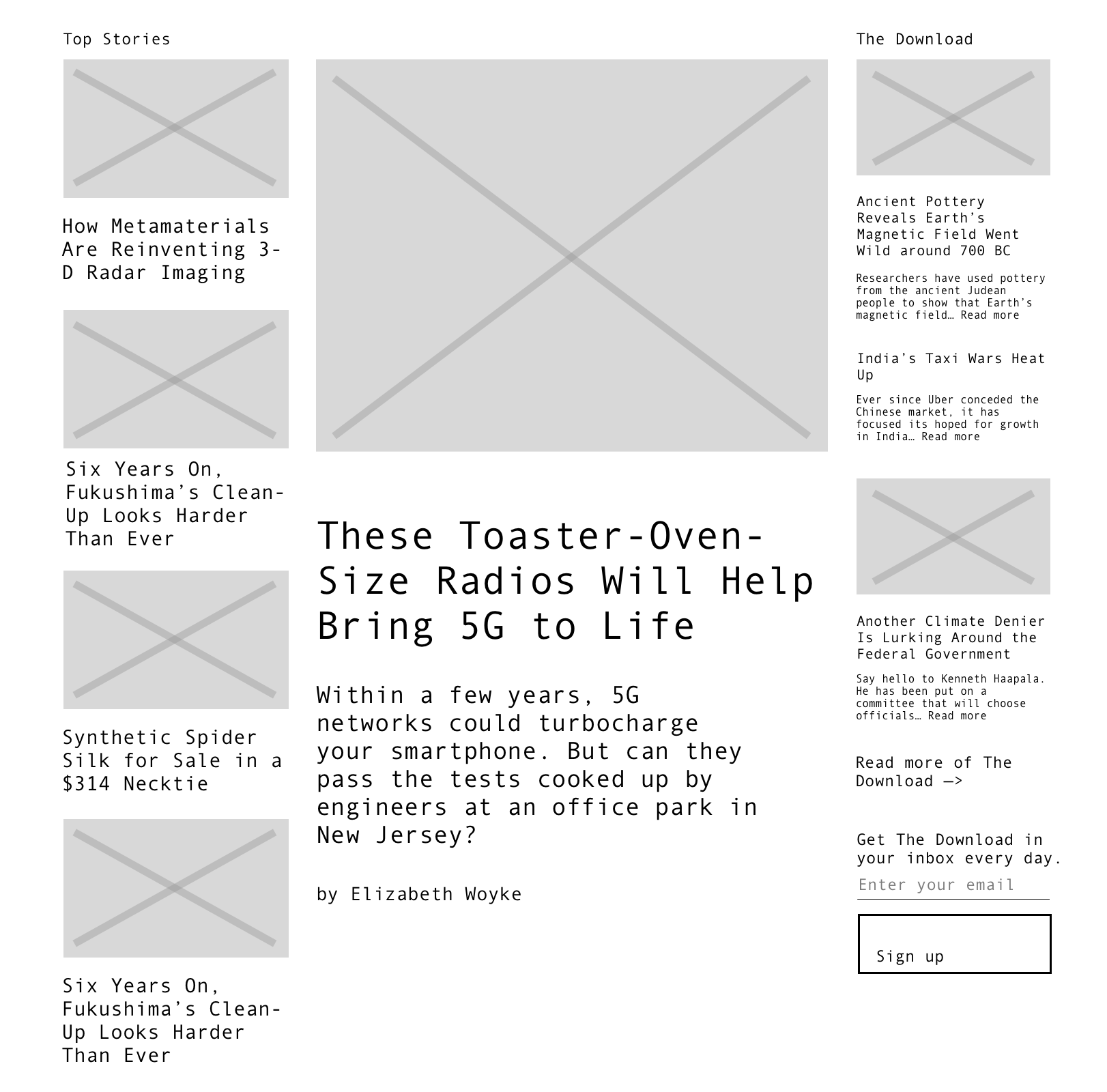
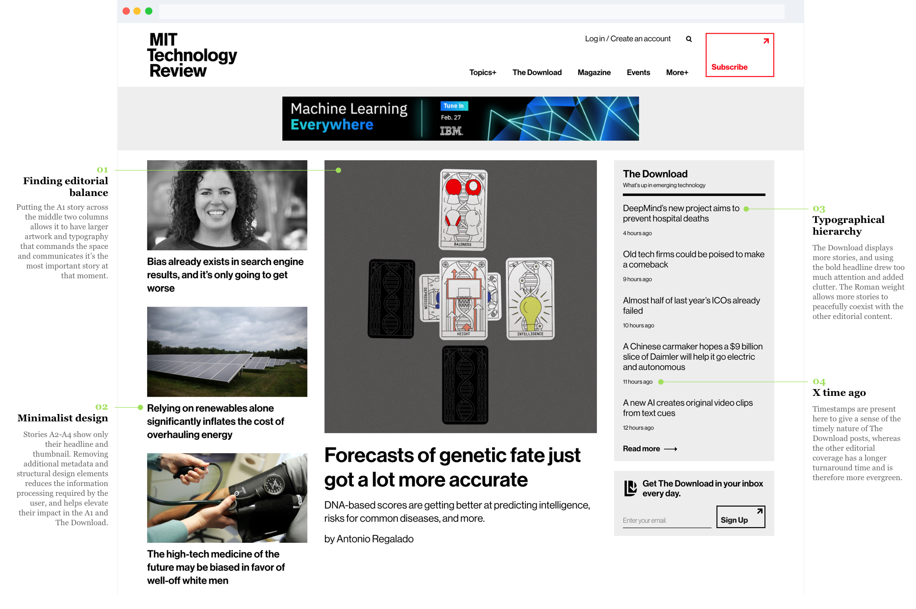
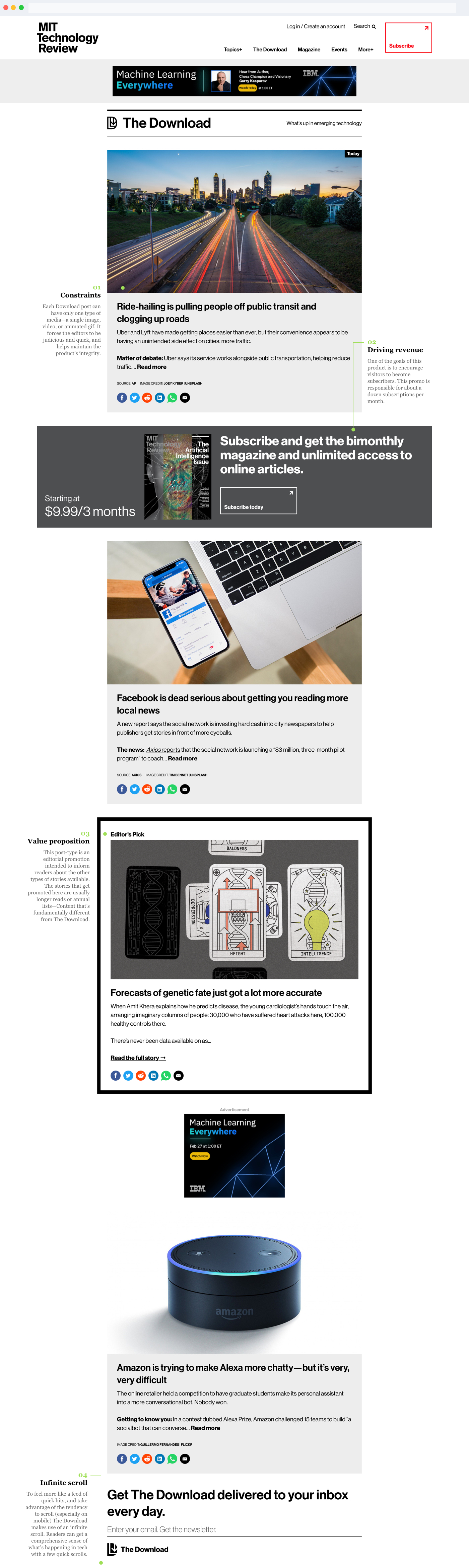
Here are the home page and the Download index in high fidelity visual design.
Outcome
The Download launched on the Tech Review website in August 2017. Our return traffic is up 25%, and pages per session is up 21%. It has also begun to drive subscriptions - about a dozen per month.